

Premiere Wine labels
Brand & Logo Creation
Package & Book Design
Stunning Photography
Custom Illustration
Email Marketing
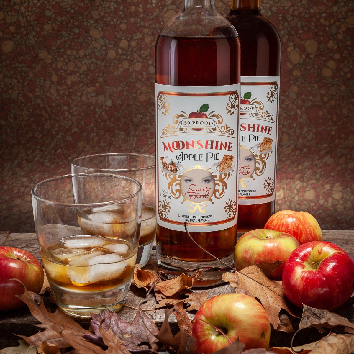
DESIGN TO FIT THE BEVERAGE.
Modern design the reaches a new audience. Haiku is designed for sake connoisseurs in and out of the Japanese market. The rice from California, the yeast from Japan, the style; fruity, light with a lovely feel on the tongue - served chilled.


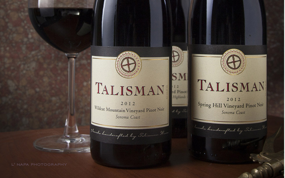
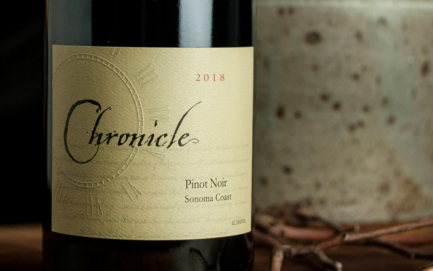
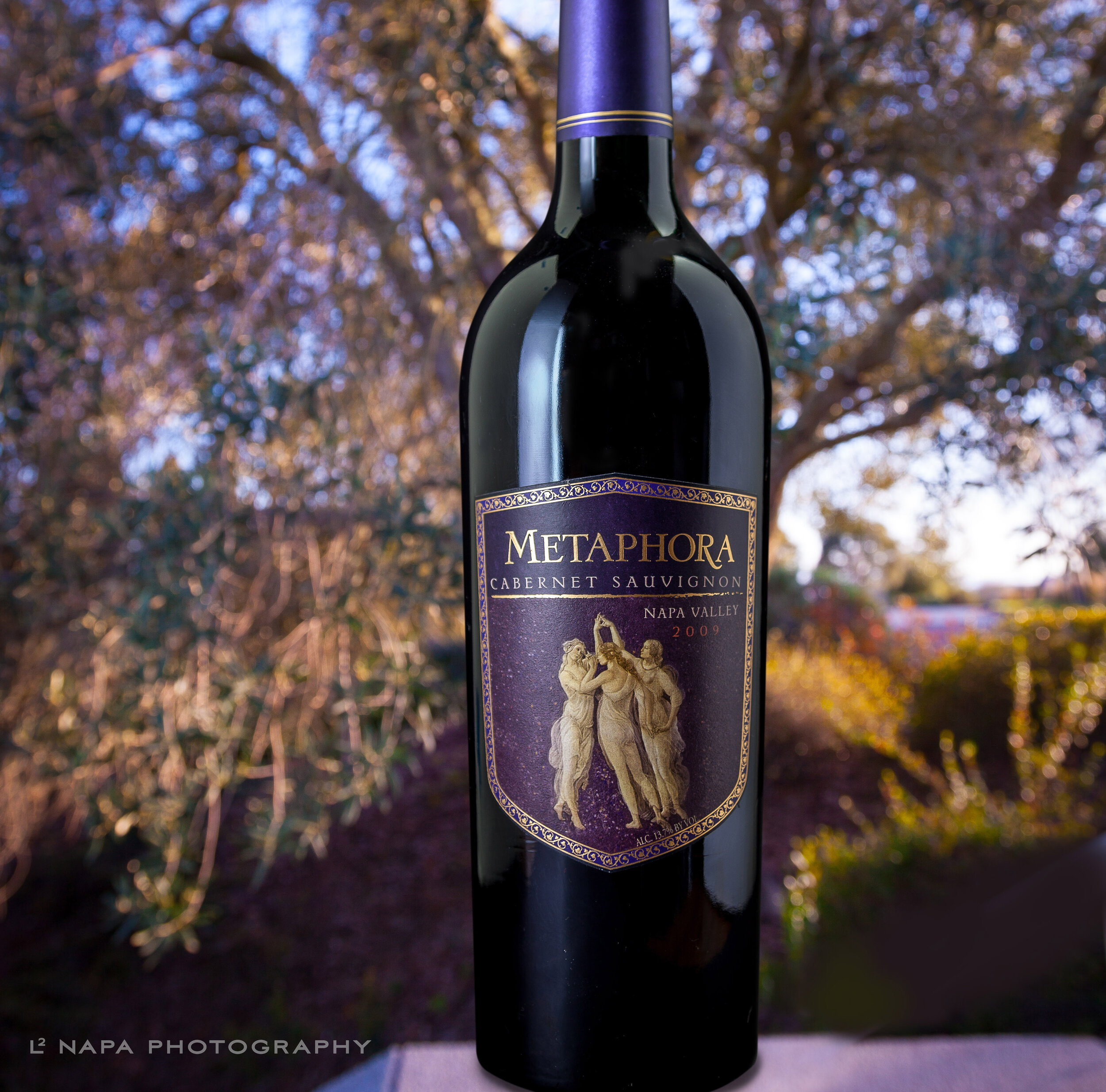

Each label tells a story. The wine producers share their stories about their history, their family, and their experiences in the wine industry. These stories are all part of the creation the wines. The label is one of the selling and marketing points for the producer, and the label must reflect the stories and personalities of the wine and its maker. Once the bottle is opened, the wine speaks for itself.
Highlands Winery brand was developed in 2003, it looked a little different than it does today. Today’s label has the same symbols of Celtic knots, Scottish St. Andrew’s cross and a braided pattern on the arms of the cross reproduced from a sgian-dubh (a knife carried in the sock of the Scots). This L2 label was awarded the blue ribbon for label design at the Orange County fair in 2009. The new Dayna Estate reserve expands this brand line. It recognizes and celebrates bees and their importance in agriculture.

book design


“There’s a book in there.”… Often heard when an author tells a story. After the story is told, frequently the author sits and types and it goes nowhere. We can help. Your book can come to fruition through a collaborative process with L2 Napa. We take the manuscript, images and format to illustrate type styles, create a cover, help edit text (if needed), and send it off to the publisher. “Viola!”
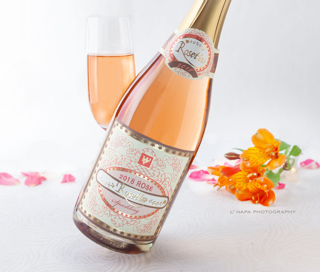
Rosé Labels
Drinkin’ pink because it’s fun, tasty and fresh when the season warms up. Many producers, seeing a glut of red grapes and wanting more concentrated flavors in their red wines, will crush the fruit and siphon off (bleed) juice from the press. This first juice is fresh and pink as it hardly touches the skin.
These are a sample of our labels that have the ladies names!

Rosetta
Wooden Valley Winery chose this design because of the demand for Rosé. The Lanza family decided it was time for their grandmother’s appropriate name to grace the label. We wanted something that was joyful and feminine, yet complex in design showcasing the color of this wine. This is one of their three Rosé labels.
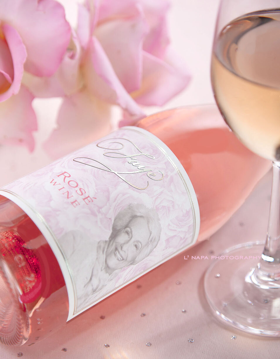
Faye
Inspired by her image, this glorious design creates a lasting memory and tribute to a delightful woman, Faye Spanos. Her daughter, Dea created an exquisite bottle of wine to share with family and friends who treasured her mother.

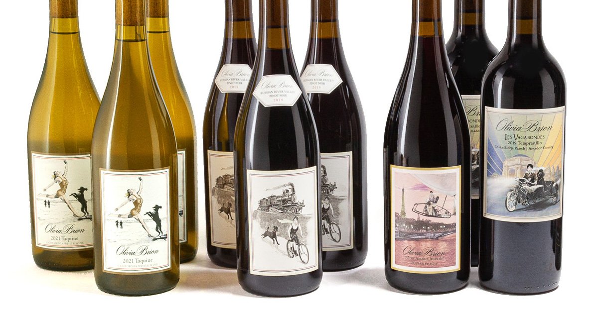
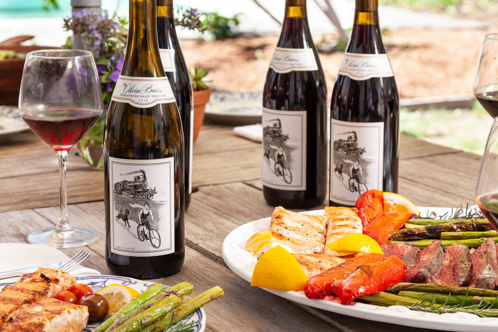
olivia
Miss Olivia, as the story goes, “was a suffragette and descendant of a great French wine family. In 1905, wearing long pants and short tresses, stunned the sporting world with her bicycle, igniting a furor.” This successful Rosé sports a decidedly playful Parisian design.
DESIGN TO SHOWCASE YOUR PRODUCTS
Lindy Ruddiman - her creative visions + photography (L2), are located in the heart of Napa Valley
Designing brands + marketing wines for over 25 years.
L2 has represented over 50 wineries & vineyards with timeless, lasting designs
Women Owned Business
“One brand, one story, one success at a time”.

Branding is everything at Wooden Valley Winery. With a tasting room and picnic area, the winery has grown in popularity and has recently been acknowledged for their many varietals grown in the area, as well as the appellation right over the hill from Napa. It is exciting to see all the different labels when you enter the tasting room. The wines are a nod to the multi-generational Italian American family that has been growing and making wine since 1933, the jug wine days!